Project DetailsTimeline
2 weeks Design Team
3 UX Designers Tools
Sticky Notes, Pen & Pencil, Typeform.com, Sketch3 & Axure |
The ProblemWebMD has come to an understanding that users have difficulty parsing through its massive collection of content. Users want a WebMD experience that is more personalized — specific to themselves or someone they are trying to help — one that does a better job of helping them find and use the information they seek.
The OutcomeAfter extensive interviews with users who search for health information online, seeking symptoms of non-chronic illnesses, we restructured the information architecture of the current WebMD website to have more simplicity and accuracy.
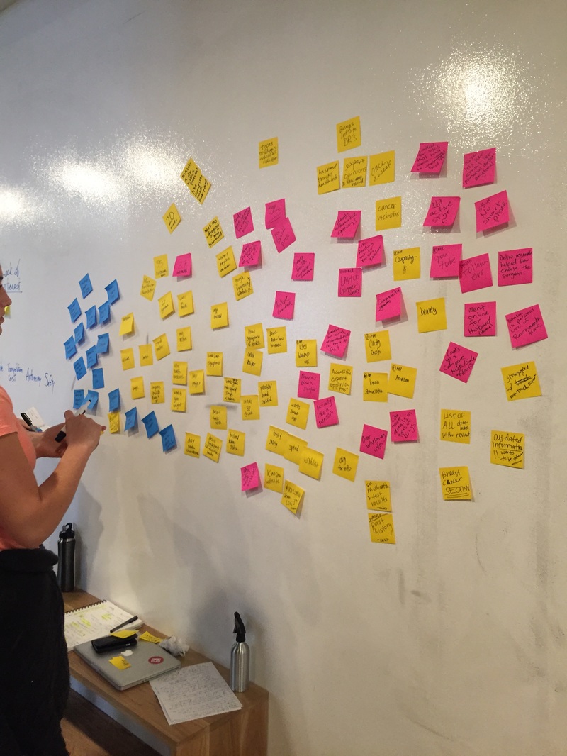
Surveys, Interviews & Contextual InquiriesFrom our survey of 66 participants, 6 in-person in-depth interviews & 3 Contextual Inquiries, we’ve uncovered the following insights:
PersonasFrom our findings & insights above, we’ve created 3 personas that sum up the types of users on WebMD. This helped guide our design process for creating a better, overall experience for WebMD that could be validated by the research we initially had.
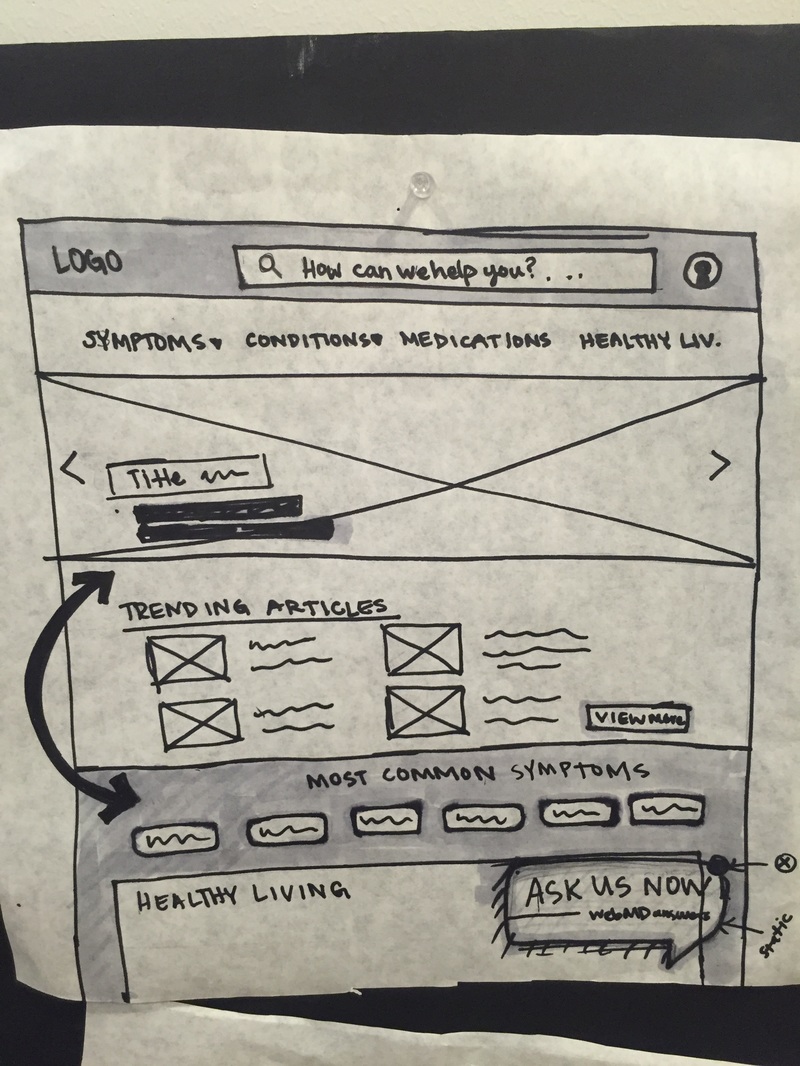
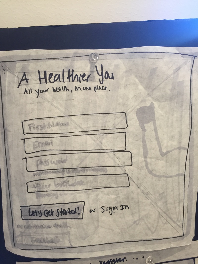
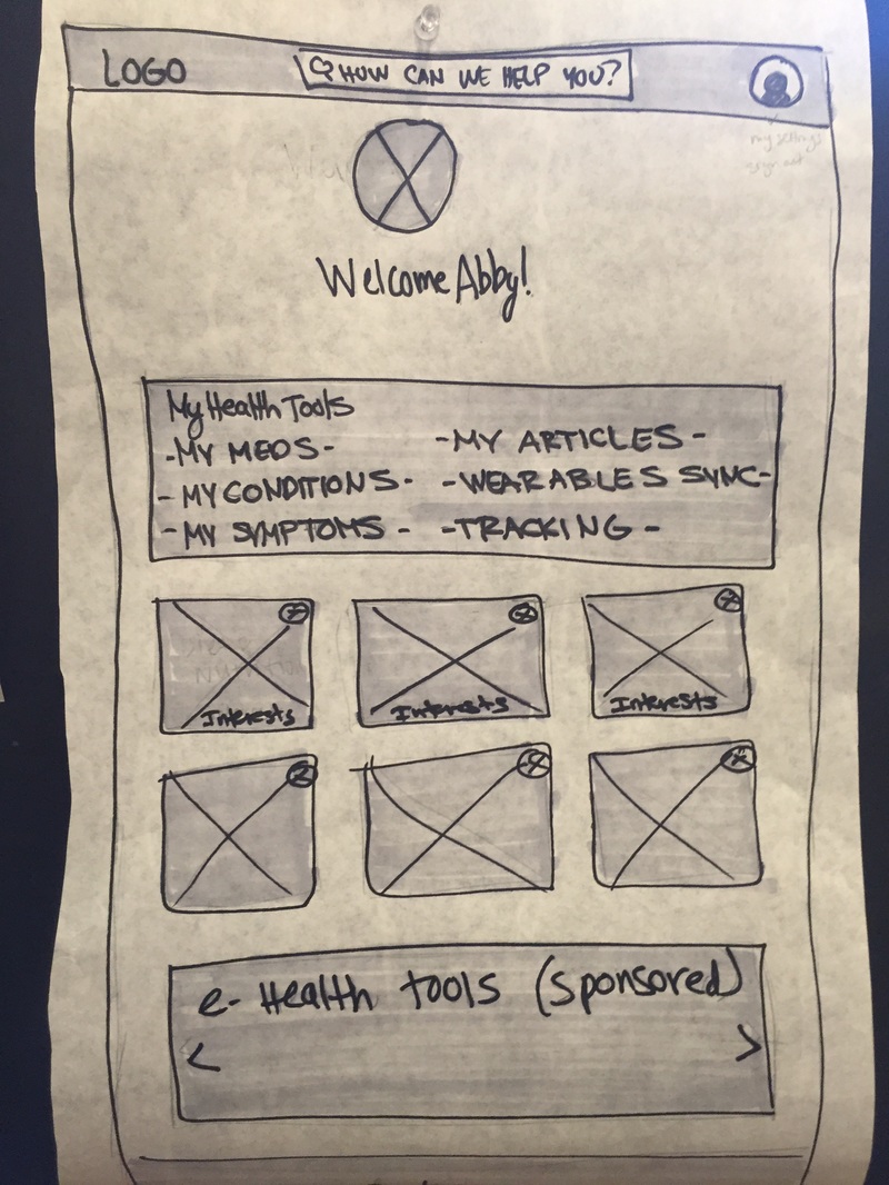
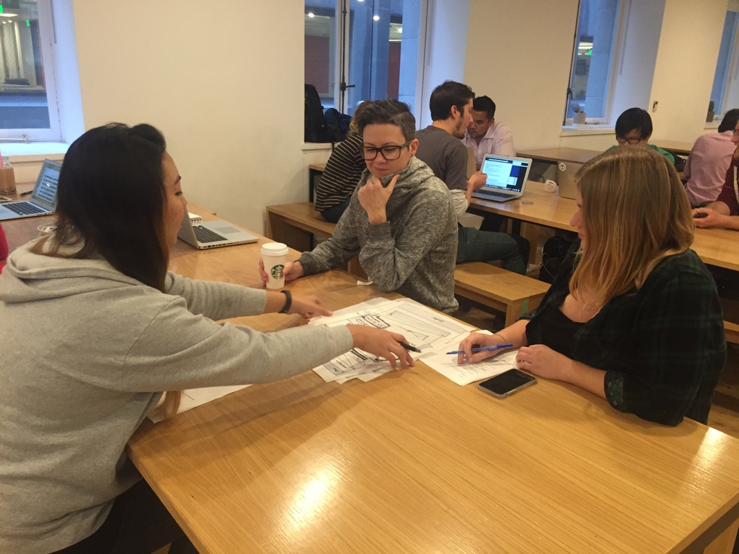
Sketching & IdeationDuring the sketching phase, I made sure that as we refined the first few drafts of our sketches, it answered the “why” factor. We took into consideration all the user research and analysis we’ve collected as a guide to sketch out best navigation placement & content strategy.
User Testing & IterationIt’s crucial to get feedback from the users we are designing for to guide the next iteration of our solution. We made sure to give our users a task to see how intuitive and easy it was for them to navigate through our paper prototype. After patterns started to take shape within the feedback we were receiving, we refined our sketches & created final wireframes.
Click to View Prototype
|